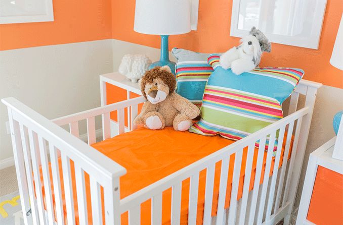
Are some colors better than others in a baby’s nursery?

The best colors to use in a baby’s nursery may surprise you
A baby’s vision develops rapidly during the first year of life. Babies are introduced to dozens of new faces, objects and colors as they get used to the world around them — especially in their nursery. And studies show that contrasting colors are best for developing your infant’s vision.
The decision for the best nursery color or color scheme might be influenced by the sex of your baby. You may also find that neutrals seem great for a certain color palette. But it may surprise you to know that certain colors and patterns can help your baby’s eyes develop.
How a baby sees their nursery
Before choosing a color for the nursery, it’s important to understand how your baby will see it. And how they see it has everything to do with their vision development.
Some fast facts about infant vision:
Babies see things 8-12 inches away from their faces. This is where most visual stimulation appears in infancy.
Newborn visual acuity (sharpness of vision) ranges from 20/200 to 20/400 at birth. (“Normal” vision is 20/20). An infant is capable of 20/20 vision at about 6 months of age.
Bright lights are harsh on newborns’ sensitive eyes. Their eyes may be more likely to open up in dimmer environments — so, consider curtains for the windows in their room.
At birth, a baby sees mostly in shades of grey. But after the first week, they can detect several colors. And by month one or two, they may even start to recognize the difference between certain colors.
Research suggests that contrasting colors are easier on their growing retinas (the light sensitive tissue at the back of the eye).
A baby’s vision is stimulated by contrasting colors, shapes, lights and moving objects — which are all things to consider when designing a nursery.
Now that you have this knowledge under your belt, what colors are the best for a baby’s nursery?
Color contrast is best for developing eyes
Experts suggest that black and white color schemes are the best for your baby’s eyes. As an infant's eyes begin to develop, their retinas can only see the difference between light and dark colors or contrasting color combinations. This is unlike a fully developed retina, which can sense all shades of color.
That said, the simple contrast between black and white is a great option for newborns. But regardless of color scheme, try to incorporate contrasting colors into your baby’s room — whether it’s in the wall paint, crib sheets, furniture or toys.
Some light and dark contrasting color combinations to try:

Designing a nursery in contrasting colors like dark gray and bright yellow is good for your baby's developing eyes.
Black and white
Pale yellow and bright purple
Dark green and red
Navy blue and orange
Maroon and seafoam green
Teal and coral
Bright yellow and hot pink
Yellow and dark gray
Further research states that babies can tell the difference between red and green, as well as blue and yellow shades by the age of 2 months. However, the hues must be intense and not “washed out” for them to really see and differentiate between them.
So, when you are decorating, try to avoid pastels and pale or light colors alone when possible. Although these colors may feel soft and baby-friendly, they actually aren’t the best option for supporting their eyesight.
Tip: Look for contrasting wallpaper patterns or wall decals for decoration. Consider designating one wall as an accent wall or placing decals on various spaces around the room. This can provide both style and purpose to the space.
Nursery colors and brain development
Colors and patterns promote the healthy development of your baby’s eyes. They also encourage brain development. How? The brain gathers information from all five senses. And with this information, nerve cells multiply and connect with other nerve cells.
Properly nourishing your baby’s vision with objects and colors helps the retinas grow and supports the optic nerve, which is connected to the brain. This is crucial for the visual parts of the brain to thrive.

